For the past few months my photos have been dominated by two things.
Apartments & color.
I enjoy color photos. The bright blues, yellows, reds. Jump into some variations like saffron (#F4C430) or ochre (#CC7722) or teal (#008080) and turquoise (#40e0d0). In terms of color palettes it is quite a deep hole one can dive into; a quick search will show you how many variations each color, like turquoise, can have.
As a child my favorite color used to be blue. Anything blue worked for me. The ocean, the sky. In a way it was a color (subtly) pushed onto men – boys blue and girls pink. Long story short as I started doing photography and became more interested in graphic design and web design my own choices of color started to move towards warmers colors.
Autumn colors if you will.
Enter monochrome.
When I started doing photography I always looked at social media for inspiration.
A bad move I now realize.
My exposure to color was the bright, over-saturated stuff. Ocean scapes, drone shots, food photos. All of these in a rich color. As a web designer you often read about true color.
“True Color” on a monitor refers to a color depth of 24-bit (8 bits per channel for Red, Green, and Blue), capable of displaying (16.7) million distinct colors.
All these colors (in a photo) gave me some chills. My photo doesn’t look like that. The leaves aren’t that green. Or that yellow. Or that type of pumpkin color. Naturally in an attempt to find my place online as a photographer I went to route of editing. Over saturated the hell out of my photos. Used S-curves to the extreme.
I don’t recall the exact moment but I discovered the channel of a photographer called Adrian Vila.
The idea of a 1:1 ratio image in black and white was a new door to enter. I started using this method and if you scroll far enough down my Instagram grid you can see the exact day where I made the transition from color to black and white.
Black and white is easy. I say this because there is only yes or no in it. No variations. No distractions. My photos depend on what you see in the image to convey what I’m trying to get across. Color distracts in my opinion. Traffic signs are different colors – to draw attention to them. Poisonous & dangerous animals are bright colored for the same reason.
Color tends to draw attention. In photography it often draws attention away from a subject or an action. That’s how I feel. That’s why I prefer monochrome. I share a photo – the viewer ‘colors’ it with their ideas and imagination.
Enter the Kodak M531. It isn’t monochrome only but it matches my approach. It’s small, easy to use without drawing attention, easy to charge, carry, needs no lens change, etc. This morning I went out with said camera and took a few photos. I regularly try to get into the swing of things when it comes to taking my camera out with me in the mornings. The problem for me is the safety factor. I will preface this by saying since I started going out with my camera in 2018 I have not been accosted, harassed or felt in fear of my safety because of my camera. But the area where I do cycle through tends to be a bit dangerous and I’m not looking for trouble if I can avoid it.
Which is why the Kodak is a perfect fit.
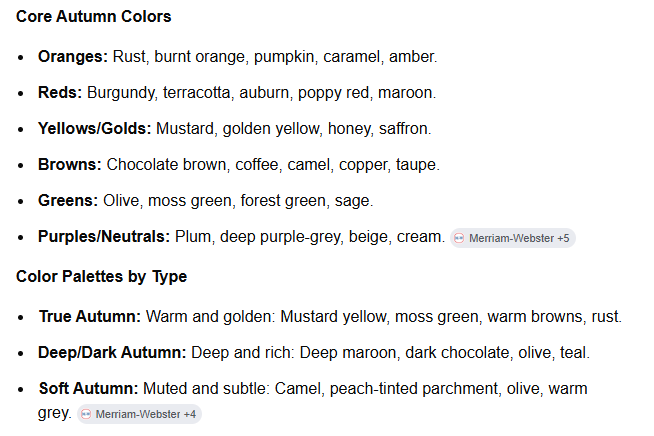
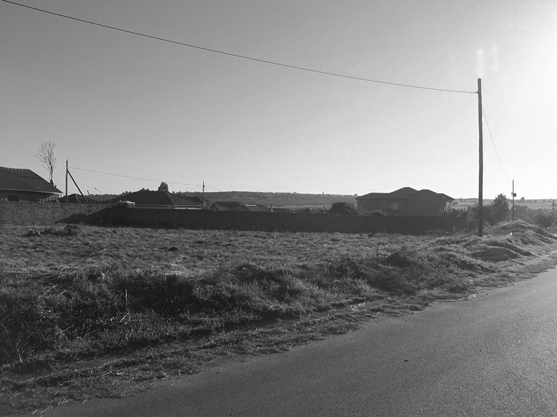
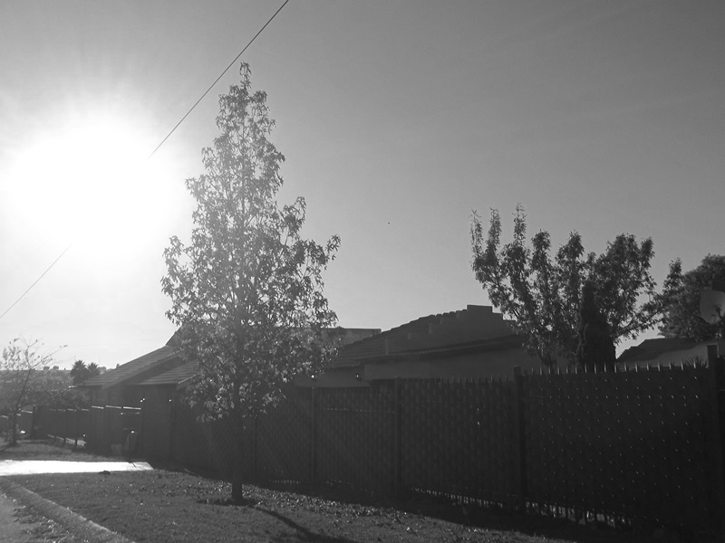
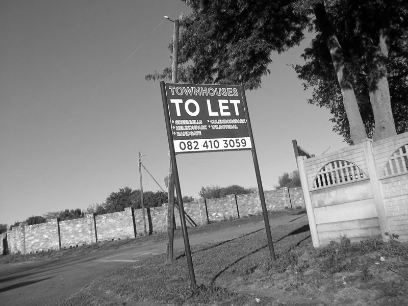
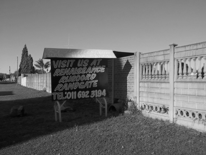
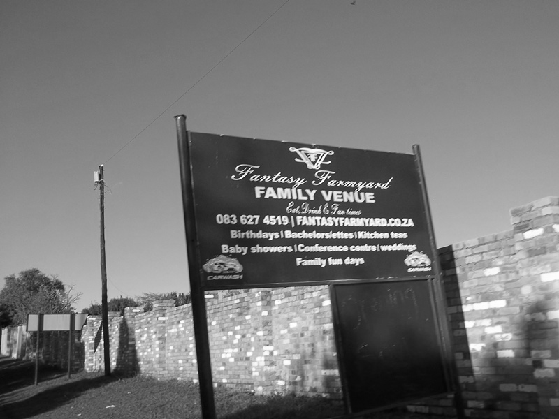
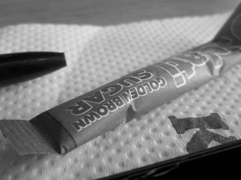
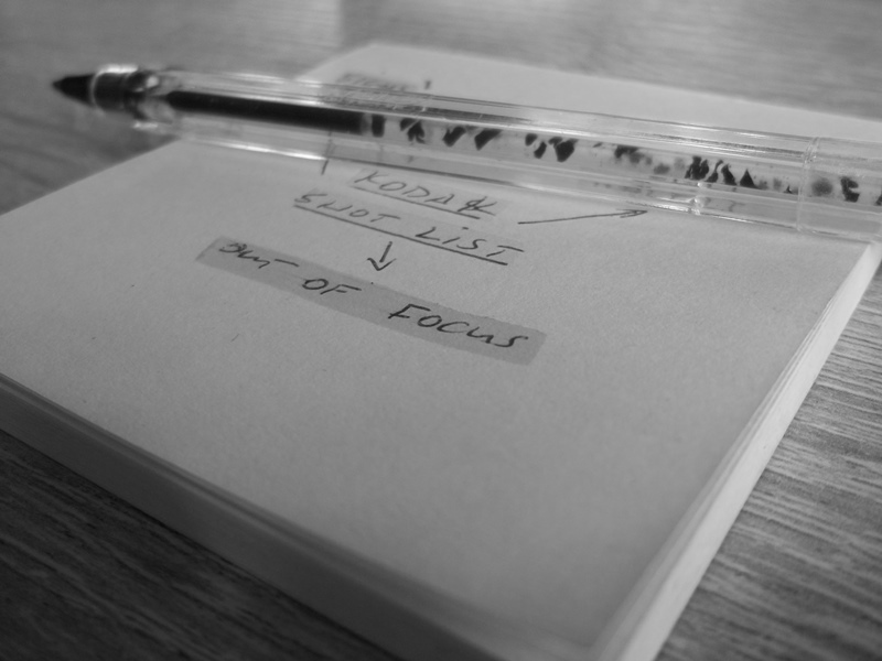
The photos.
All this talk has probably made you reach for a cup of coffee so without further ado I share with you some of the images I took earlier today. If my discipline sticks I will try taking photos on a more regular basis with the camera.
It’s Sunday which means my latest edition of my newsletter should be in subscribers inboxes during the course of the day. If you’re not a subscriber you can enter your email addy below and become one. Once or twice a month I write about something photography related. I also share more images on Notes which I don’t always post elsewhere.
Thanks for reading : )